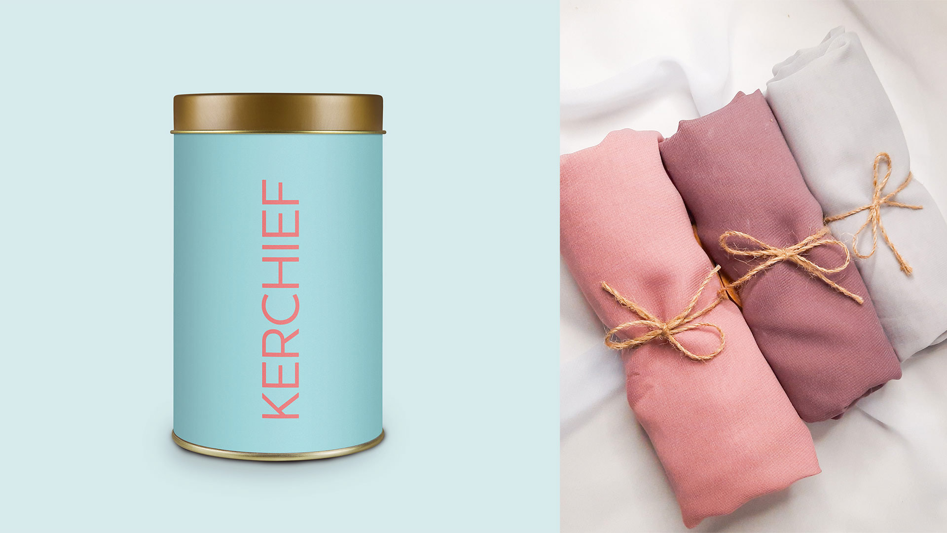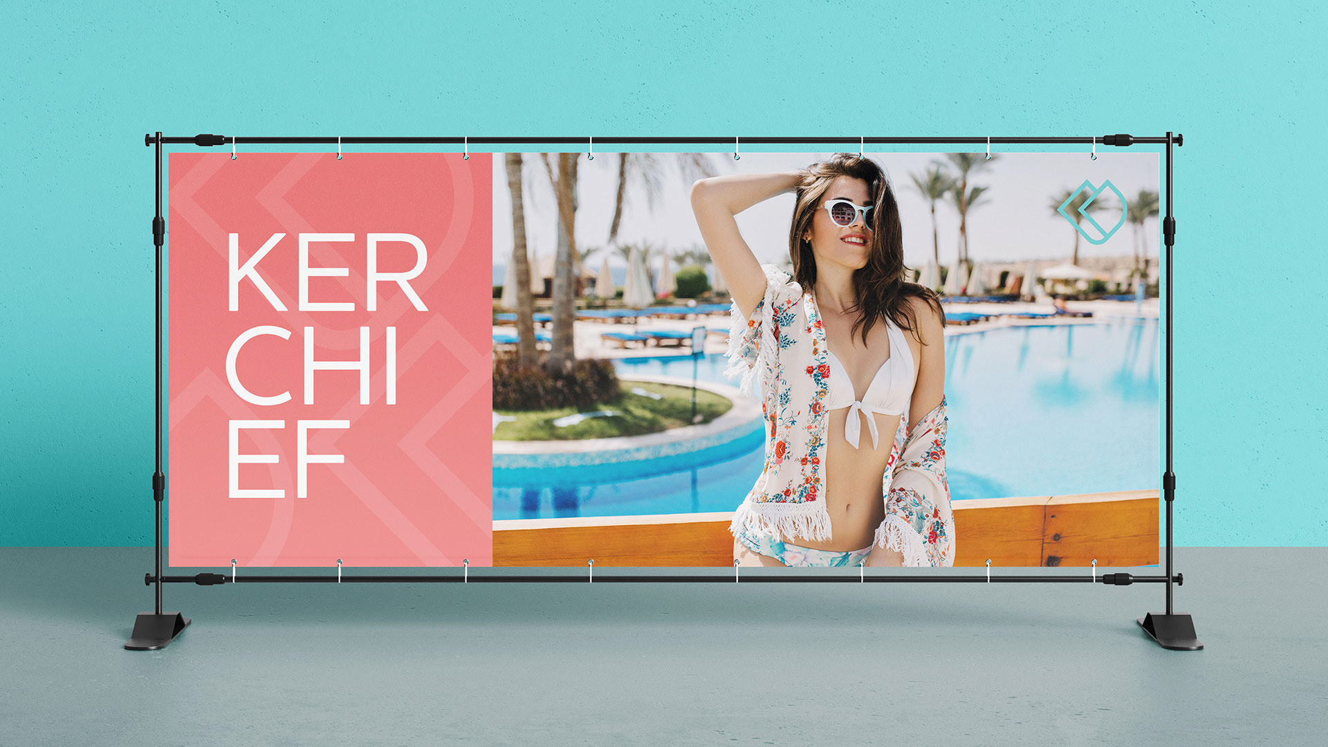
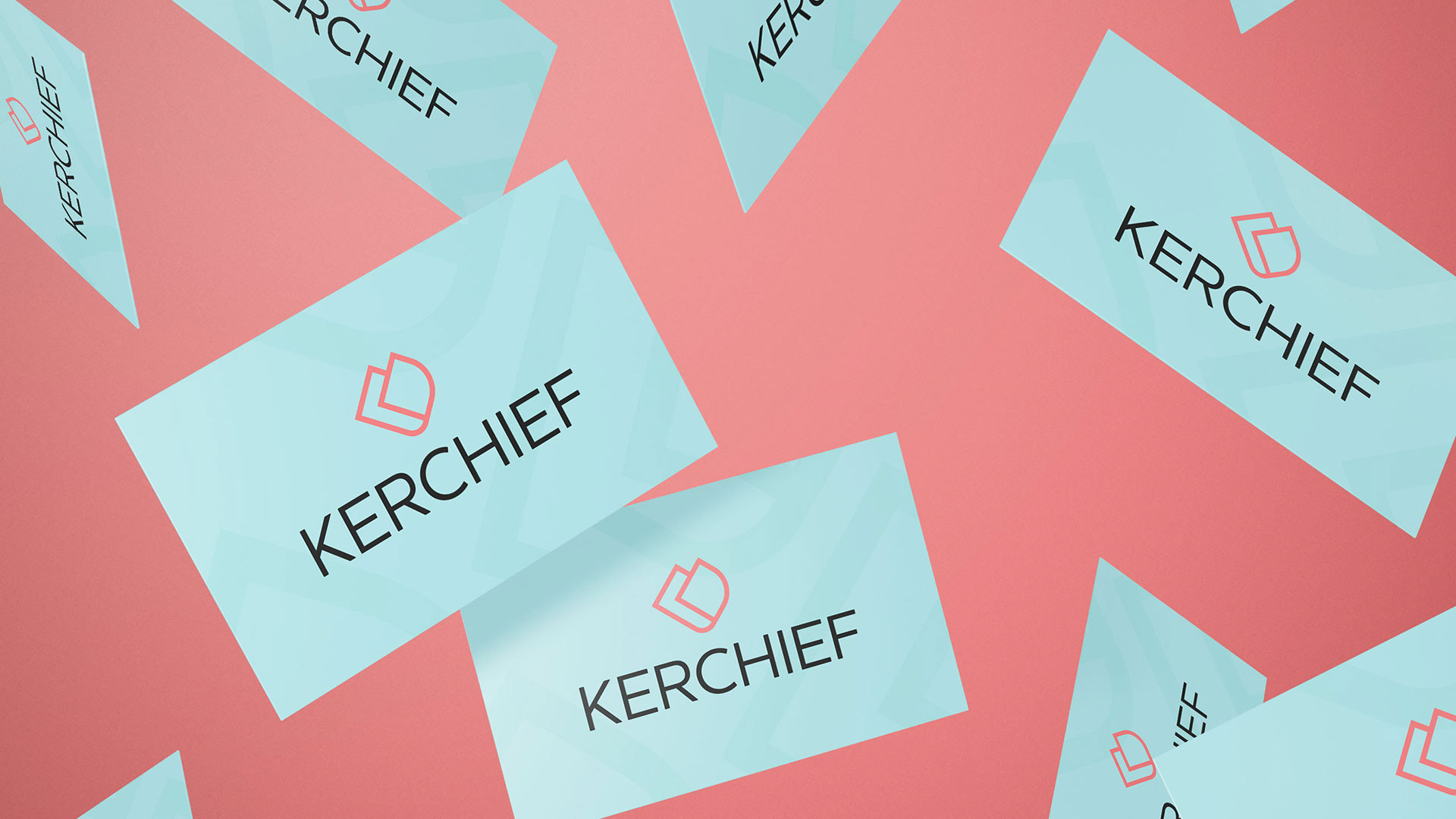
"Personalidade em forma de lenços".
É assim que se apresenta a marca KERCHIEF.
Marca que prioriza looks com elegância e sofisticação de forma fácil e inteligente para o dia a dia da mulher. Uma única peça proporciona infinitas formas de uso.
É assim que se apresenta a marca KERCHIEF.
Marca que prioriza looks com elegância e sofisticação de forma fácil e inteligente para o dia a dia da mulher. Uma única peça proporciona infinitas formas de uso.
-
"Personality in the form of scarves".
This is how the KERCHIEF brand is presented.
Brand that prioritizes looks with elegance and sophistication in an easy and smart way for women's daily lives. A single piece provides infinite ways of use.
Brand that prioritizes looks with elegance and sophistication in an easy and smart way for women's daily lives. A single piece provides infinite ways of use.
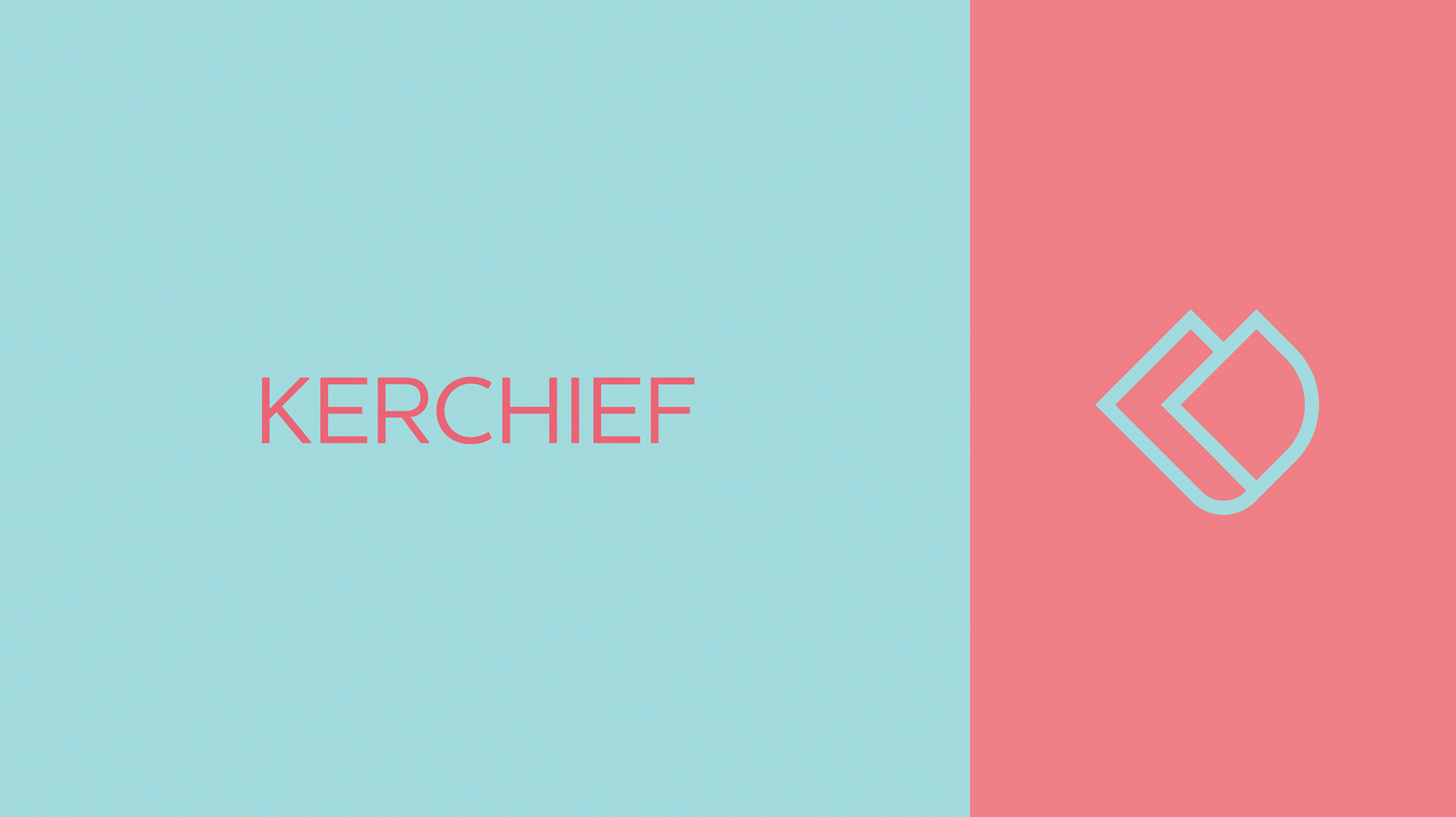
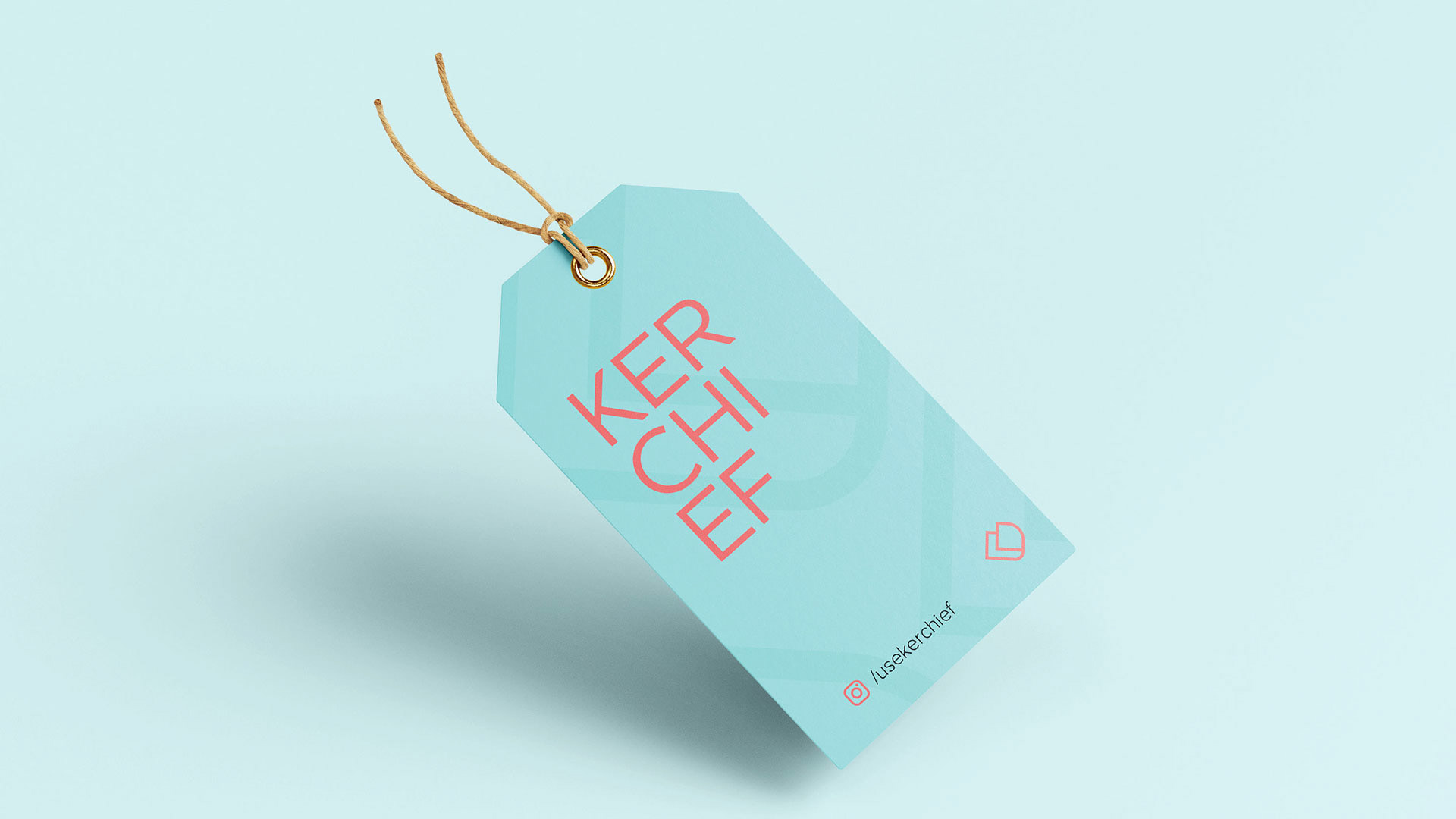
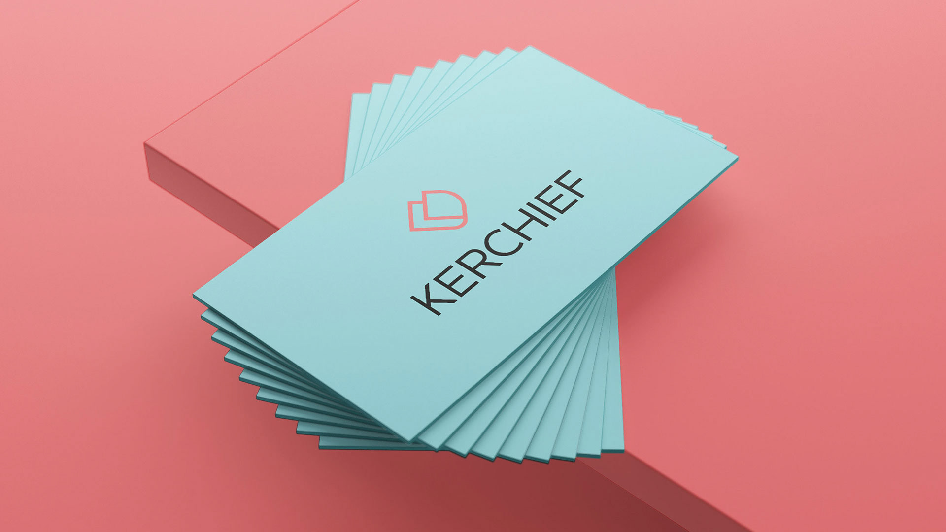
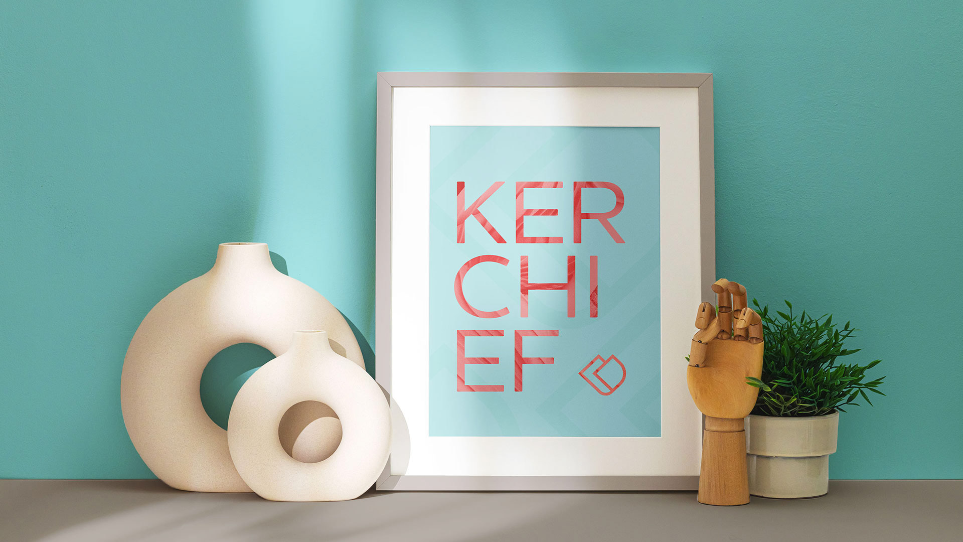
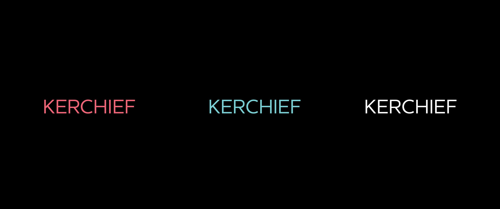
A escolha da tipografia teve como foco uma fonte elegante e de fácil legibilidade.
As letras em caixa alta demonstram elegância e seriedade, agregando valor ao produto, ao mesmo tempo em que suas bordas levemente arredondadas trazem um tom de leveza para a tipografia.
As letras em caixa alta demonstram elegância e seriedade, agregando valor ao produto, ao mesmo tempo em que suas bordas levemente arredondadas trazem um tom de leveza para a tipografia.
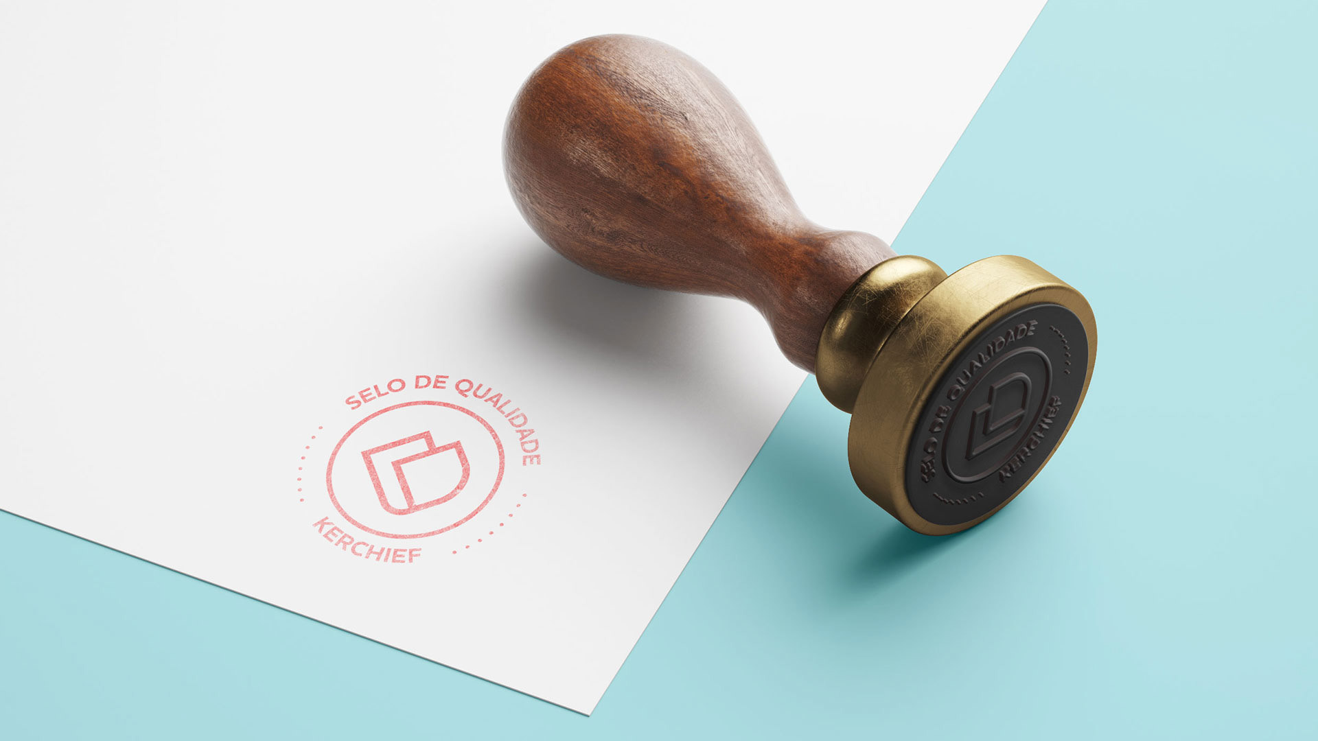
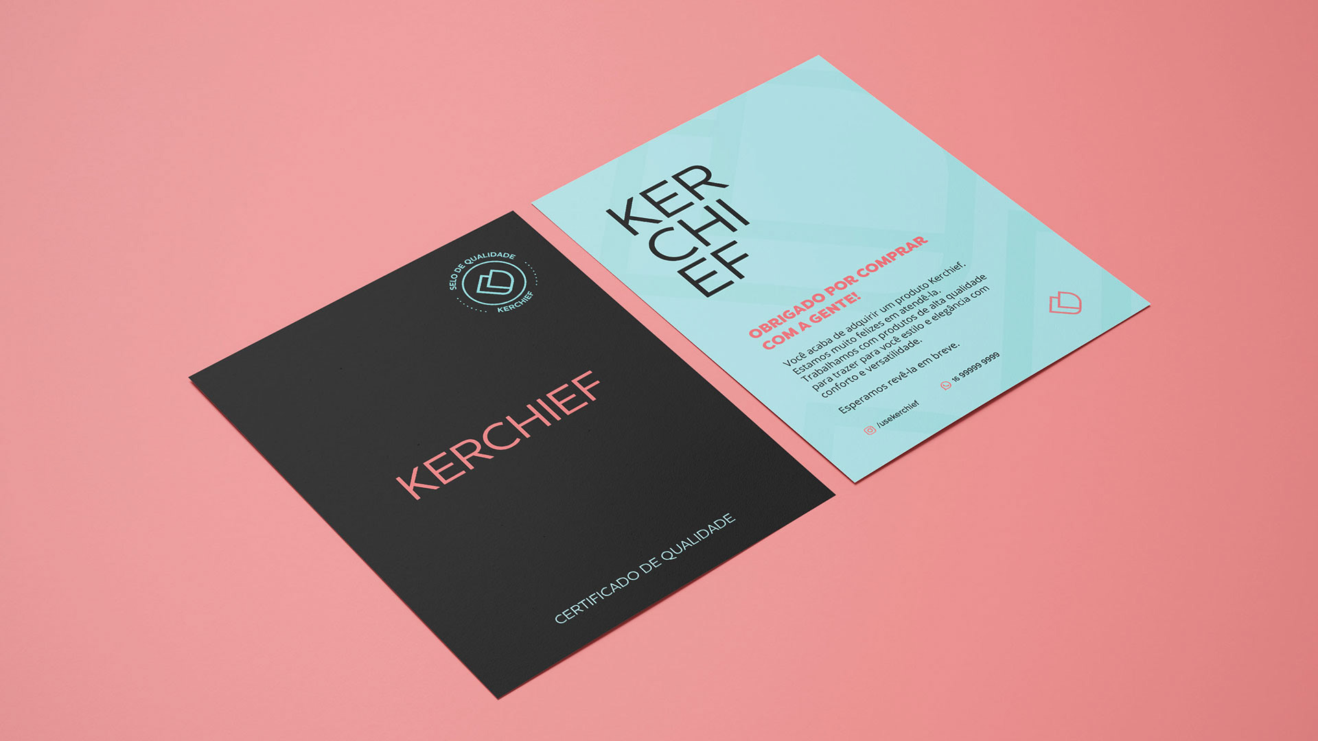
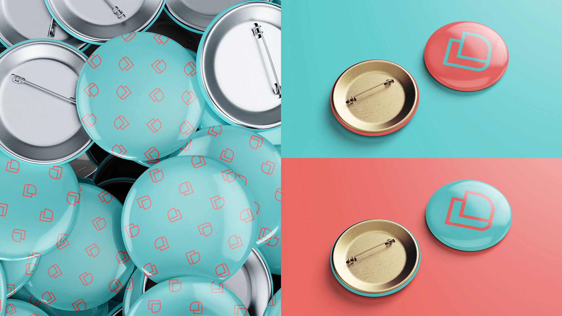
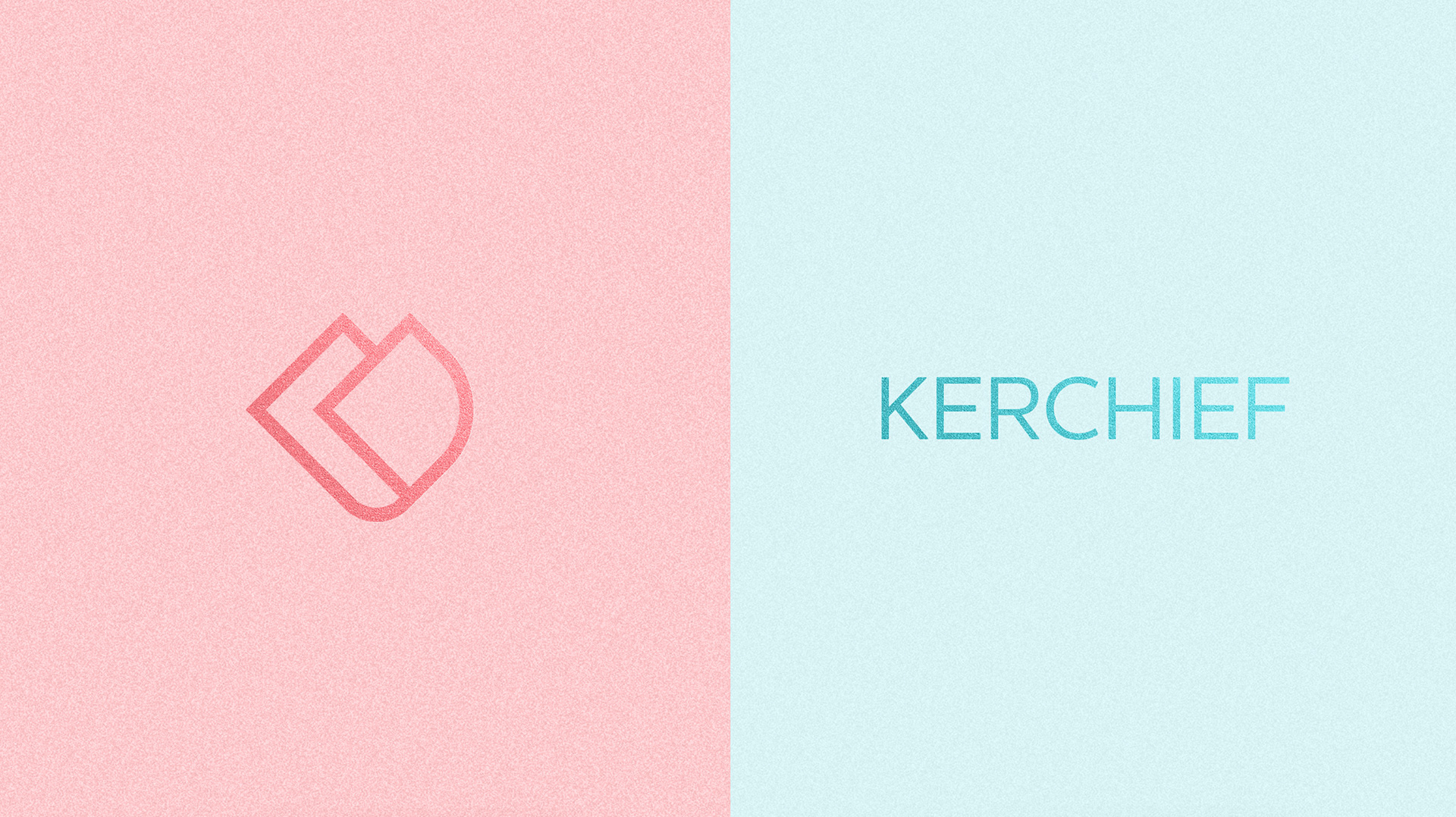
O símbolo foi pensado de forma a representar um lenço sendo dobrado ao meio (em um ângulo de 45 graus). A intenção é a de mostrar a versatilidade do uso dos lenços, que dobrados, podem ser utilizados das mais variadas formas. Com poucos traços, o símbolo é representado de forma minimalista e discreta. Com isso, é possível sua aplicação com facilidade nos mais variados formatos impressos ou digitais. Na lateral esquerda, pode-se notar uma discreta alusão à letra “K”, de KERCHIEF. Ao ser visualizado em seu contorno, também remete ao formato de um coração.
-
The choice of typography focused on an elegant and easy-to-read font.
The letters in capital letters demonstrate elegance and seriousness, adding value to the product, while their slightly rounded edges bring a light tone to the typography.
The letters in capital letters demonstrate elegance and seriousness, adding value to the product, while their slightly rounded edges bring a light tone to the typography.
The symbol was designed to represent a scarf being folded in half (at a 45 degree angle). The intention is to show the versatility of the use of scarfs and kerchiefs, which folded, can be used in a variety of ways. With few lines and curves, the symbol is represented in a minimalist and discreet way. With this, it is possible to apply it with ease in the most varied printed or digital formats. On the left side, one can notice a discreet allusion to the letter “K”, by KERCHIEF. When visualized in its outline, it also refers to the shape of a heart.
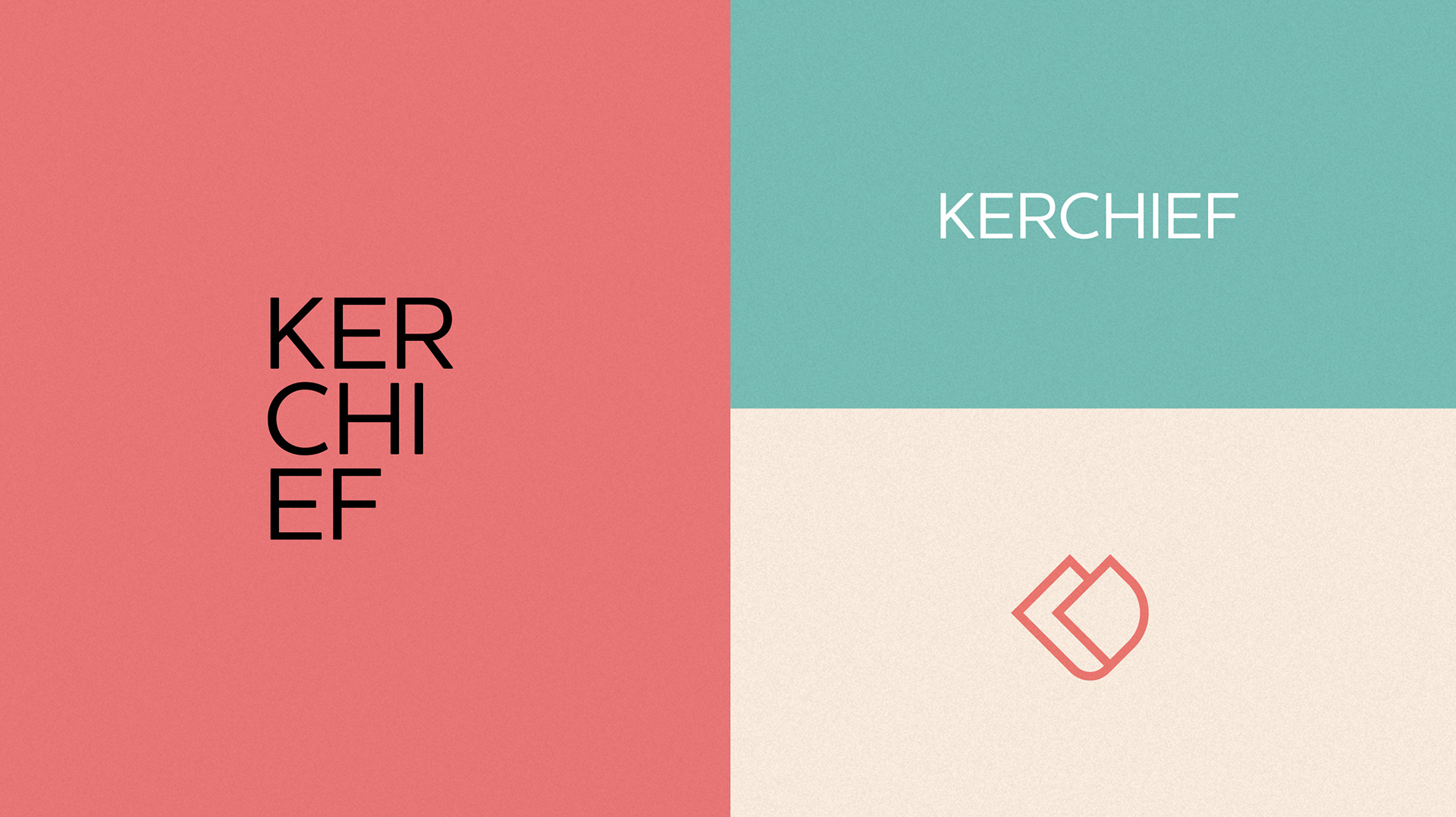
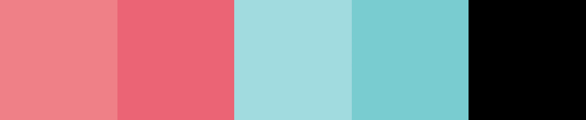
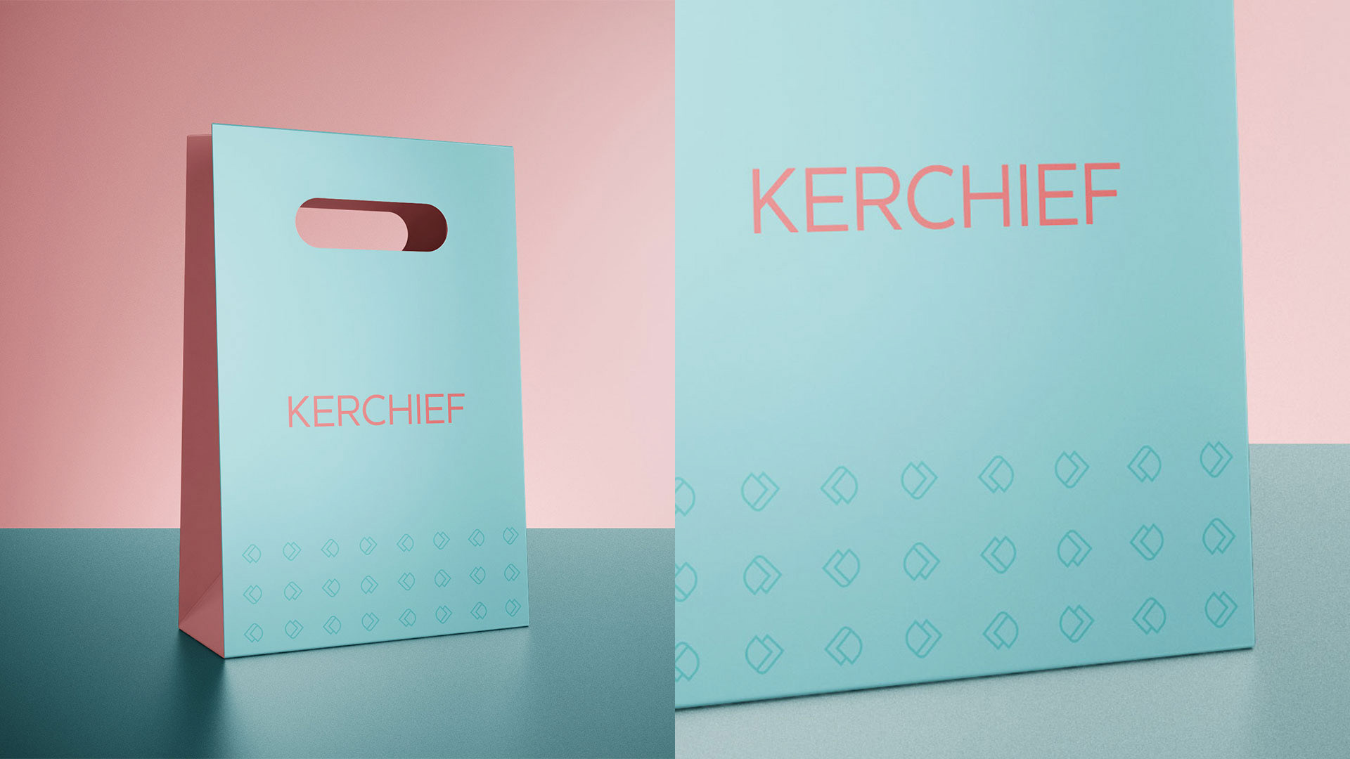
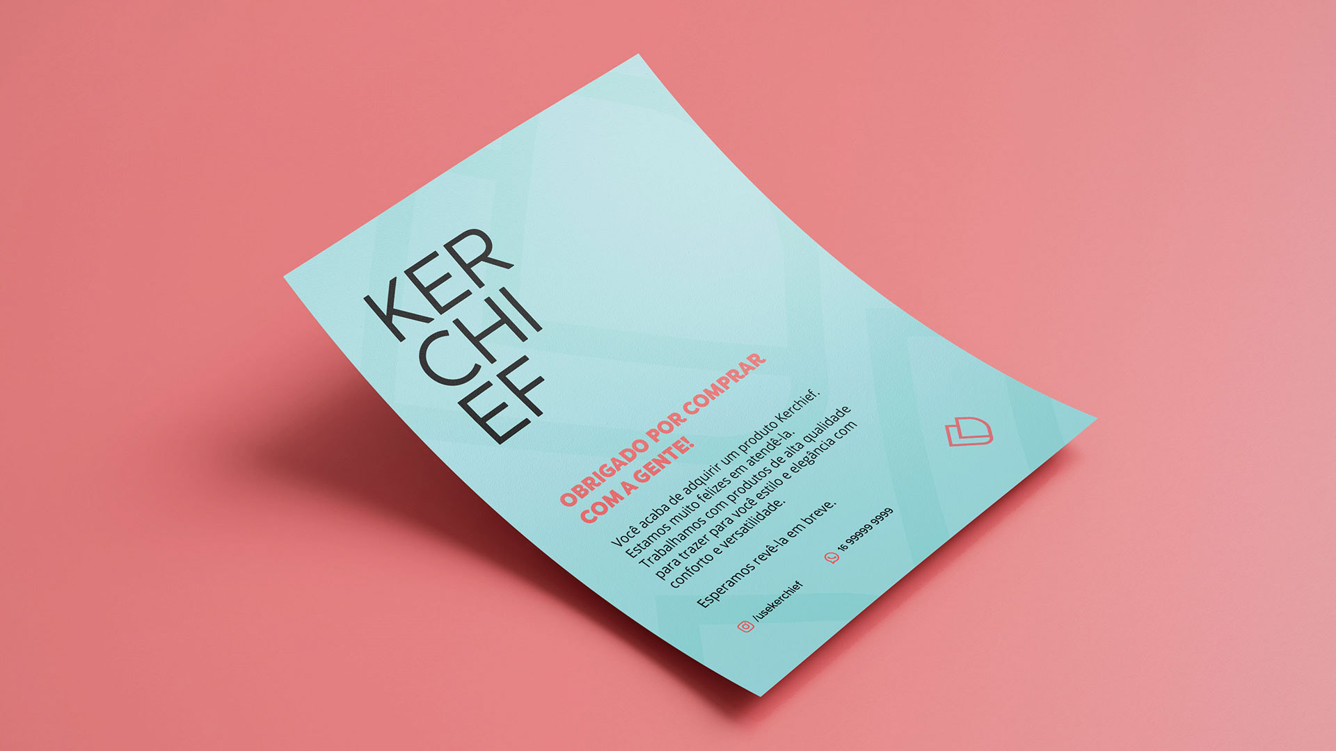
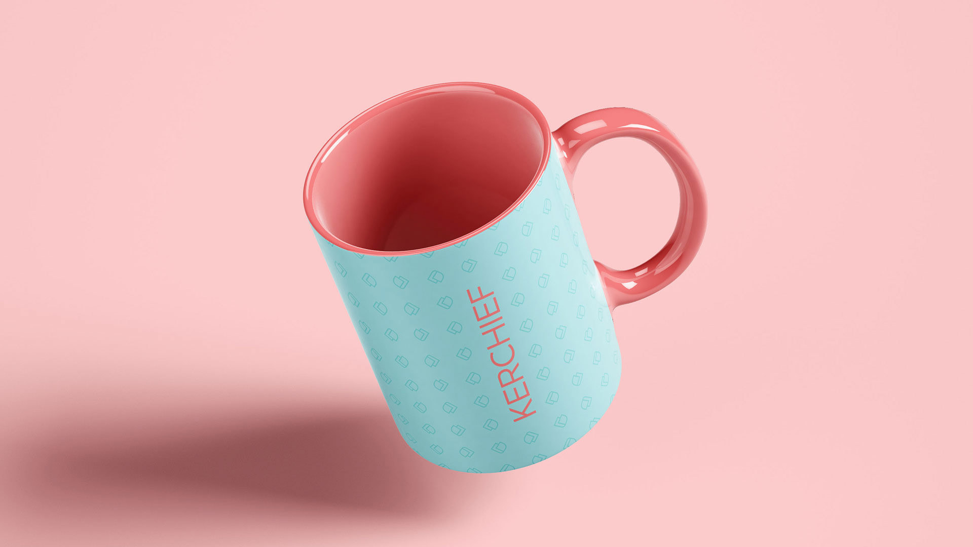
A escolha da paleta de cores teve como foco a feminilidade do rosa, somado à liberdade do verde e à força e elegância do preto. O uso da identidade da marca pode variar entre essas cores, trazendo versatilidade para as aplicações, assim como os lenços trazem versatilidade em suas diversas formas de uso.
-
The choice of color palette was focused on the femininity of pink, added to the freedom of green and the strength and elegance of black. The use of the brand's identity can vary between these colors, bringing versatility to applications, just as scarves bring versatility in their various forms of use.